
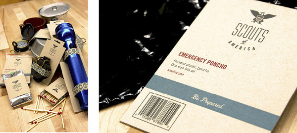
I love this project by American designer Chris Klee. He's rebranded the American arm of the Boy Scouts and turned it into something much more grown up and mature.
"The biggest challenge was to eliminate the childish perception youth have about Boy Scouts. By removing the word boy, the organization becomes more desirable and timeless, appealing to the sense of adventure Scouts have. In a generation where kids are continually choosing computers over nature, Scouts make the decision to explore and are prepared for any challenge."You can see more of Chris's work here.


Such edgy strokes that gives that manly look. I've seen most of his works, and I'm a fan!
ReplyDelete